|
Logos

I create a lot of personal logos (usually that of "GDS") when I feel creative,
or to practice. The demand for good logos is always growing, so it is good to maintain
fresh styles and new ideas for logo design. As always, for newer, or the latest images,
visit the Portfolio section.
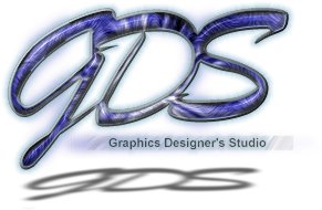
"Marble GDS" (Dec 2000)
One of my favorites, this image demonstrates why I often do my designs on white backdrops. Dark backdrops cannot fully implement drop shadows, which can potentially add a lot of depth and character to web designs/logos. While drop shadows are often overused, perspective shadows are not, and fit well with logos such as this.

"Yellow Wish GDS" (May 2000)
Again experimenting with the yellow/orange colorscheme on a white background; this logo was around the same time I created a Flash website with this same colorscheme (red/orange on white background). The font for the background text is "SnapITC".
"Electric GDS 2" (May 1999)
A derivation of the same idea as the original "Electric GDS" logo.
"Electric GDS" (Apr 1999)
One of my first "real" logos in terms of quality and production value. A favorite of myself and my friends from my early days.

"GDS Flood Button" (Apr 1999)
A small simple flood logo with a lense flare by hand and a manually enhanced gradient. This was used on my original business cards.

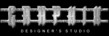
"GDS Plate" (Mar 1999)
GDS text on a big plate. I was playing with some color schemes, orange/red looks fairly nice on solid black. I was going for a "cutout" feel, as if this logo was stamped like a liscense plate. The font used is "Mattise ITC".

"Blue Fire Graphix" (Feb 1999)
Very blue rendition of a logo. I like the blue fire, but I was going filter happy at the time!
"Fire Particles (Graphics)" (Jan 1999)
Fun logo with white particles circulating around the main text. The orange trials were done by manually smearing an orange blur.
"Monochrome Graphix" (Oct 1998)
Earlier logo using light and shining shades gray. The texture was created with EyeCandy, when the EyeCandy filters were popular

"Purple Comic Graphix" (Oct 1998)
Purple washed logo with a comic book gradient.

"Round Aqua GDS" (Oct 1998)
A logo meant to look like the bottom of a pool with it's hints and color. Inspired from the official "AutoFX" logo of the time.
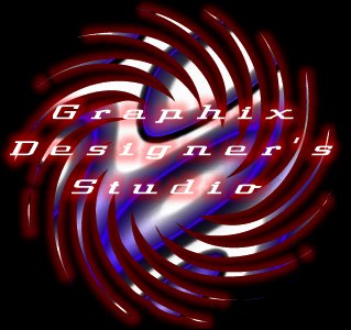
"Red Spiral GDS" (May 1998)
One of my first logos for GDS, even before creating the GDS site. The texture is a custom texture (flat 2d image with a hot wax filter applied over it, colorized blue) in the shape of a spiral. The spiral shape is from the font "Button Button". Unfortunately I knew little about text readability, and the logo is difficult to read.
|

|